
Portfolio
UX DesignDue to my background in psychology, I design with a strong focus on the user. That is why I make sure that interaction designs and prototypes are efficient, intuitive and matching the user's way of thinking. In particular I enjoy the challenge to translate complex information into smaller, easy to understand packages. For my visual designs I prefer a clean, minimalistic and a well organized user interface.
|
UX ResearchIn particular I am interested in the needs and motivations of online users. Finding out the context in which they use an application gives a better understanding of the users' mindset. The interface that they work with should reflect this. My goal is to optimize usability, by minimizing the amount of actions (and thus the mental load) for users when they navigate a website or application.
|


UX Design
|
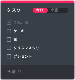
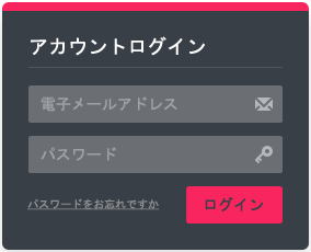
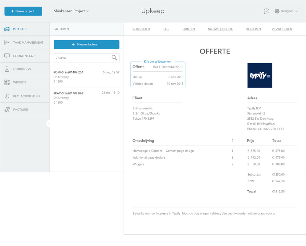
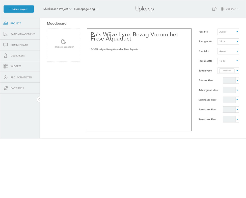
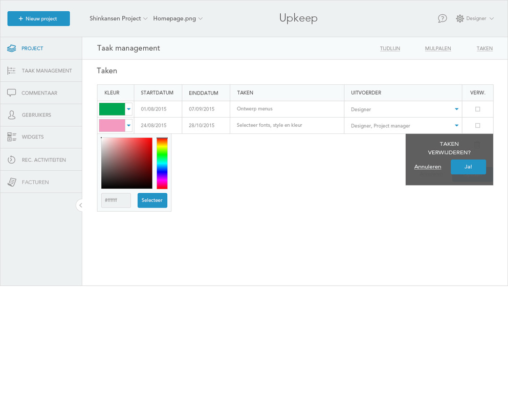
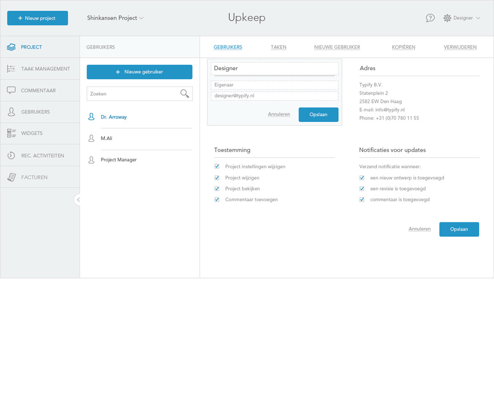
Visual designs and logo of the organizer application (mobile)
|
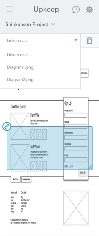
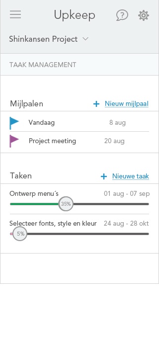
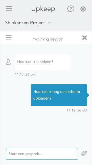
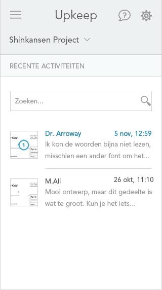
Organiser application
|
|
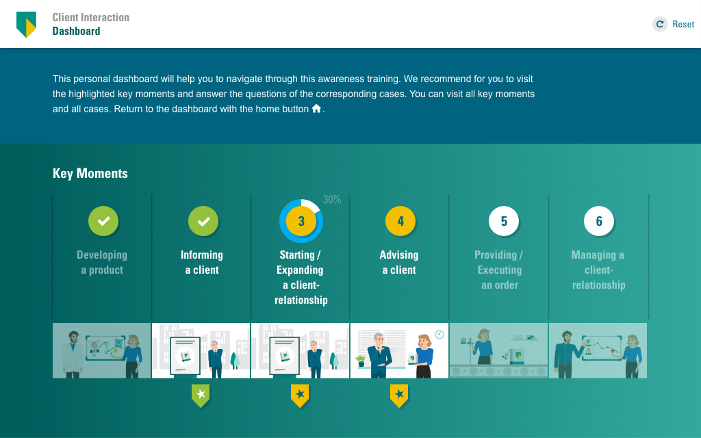
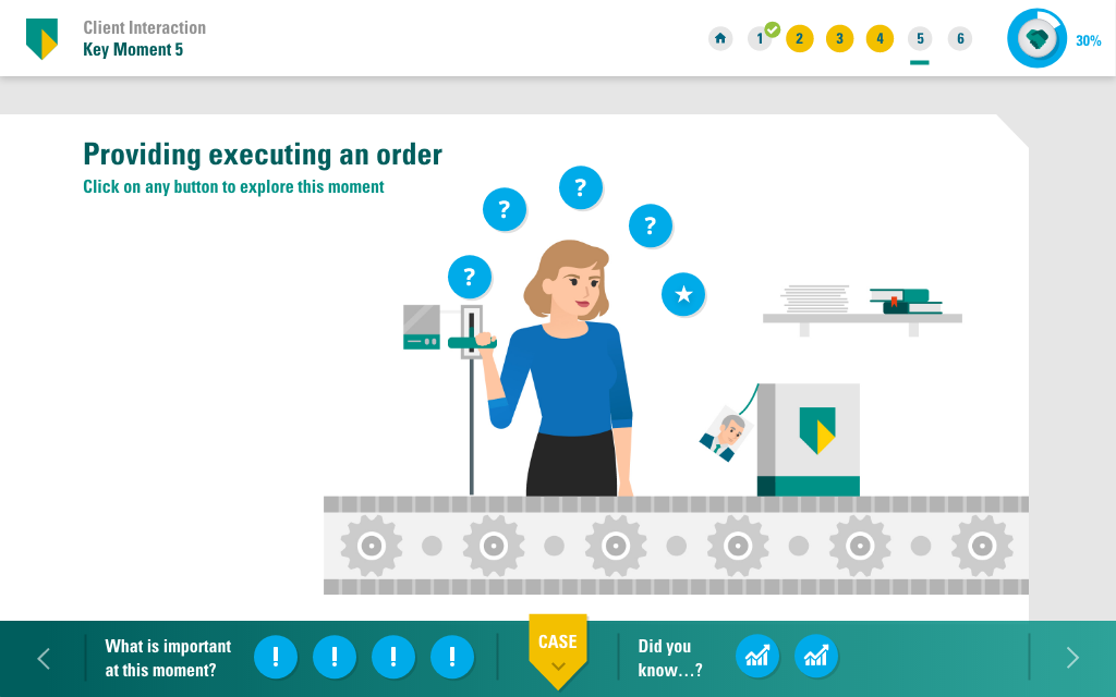
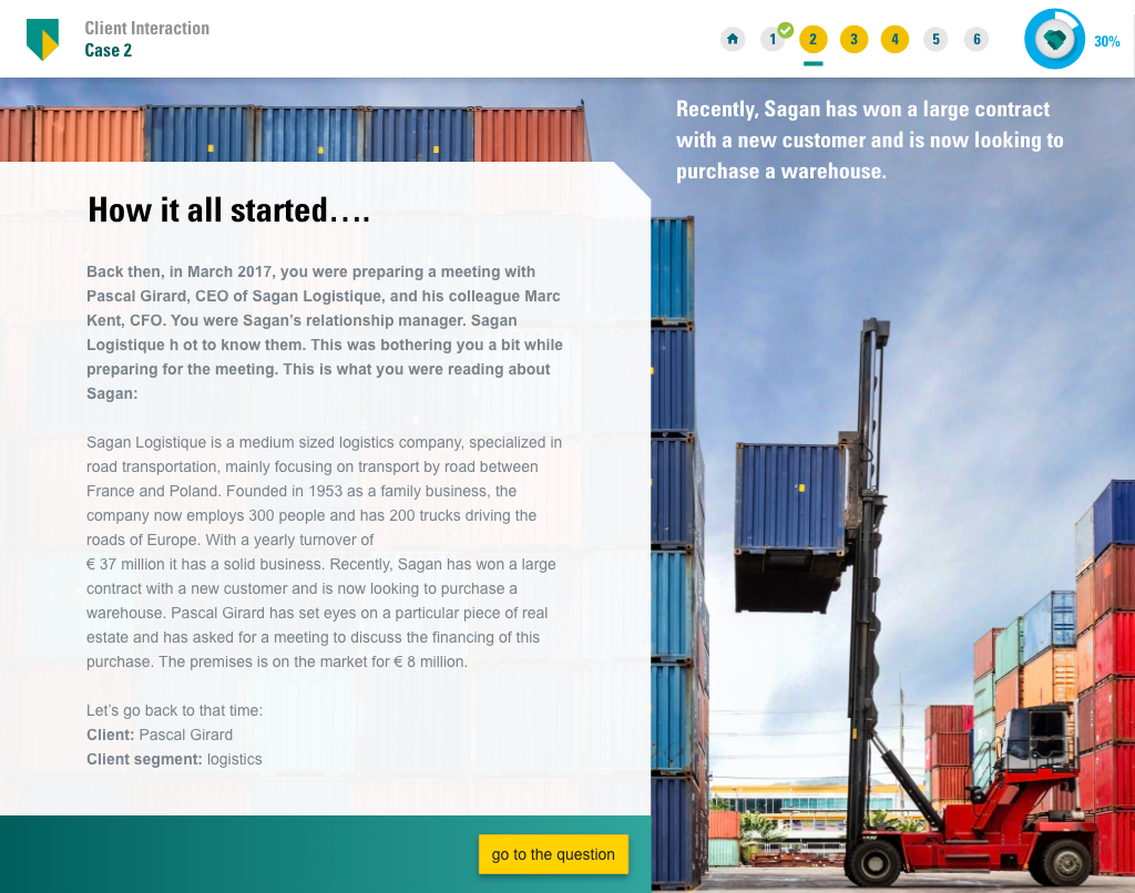
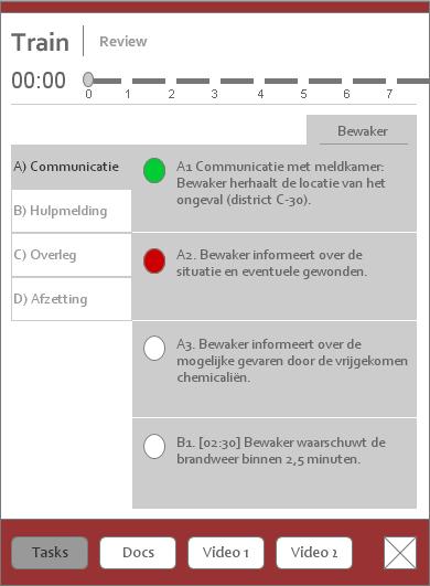
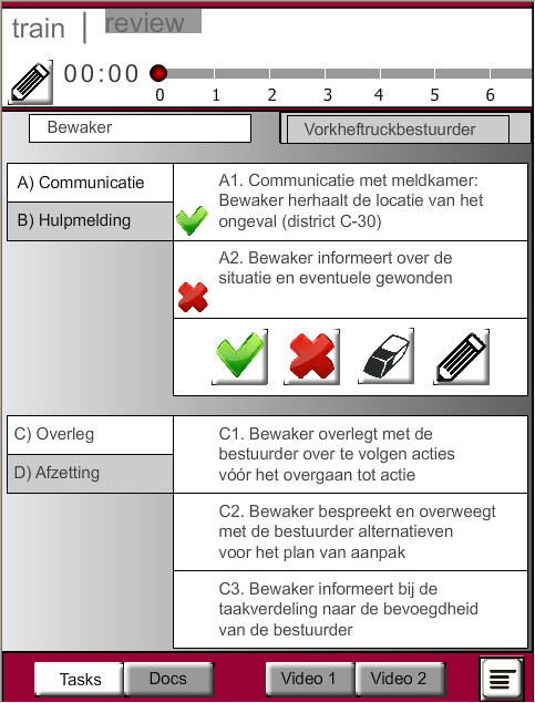
User interfaces of the training application (tablet)
|
Banking training application
|
|
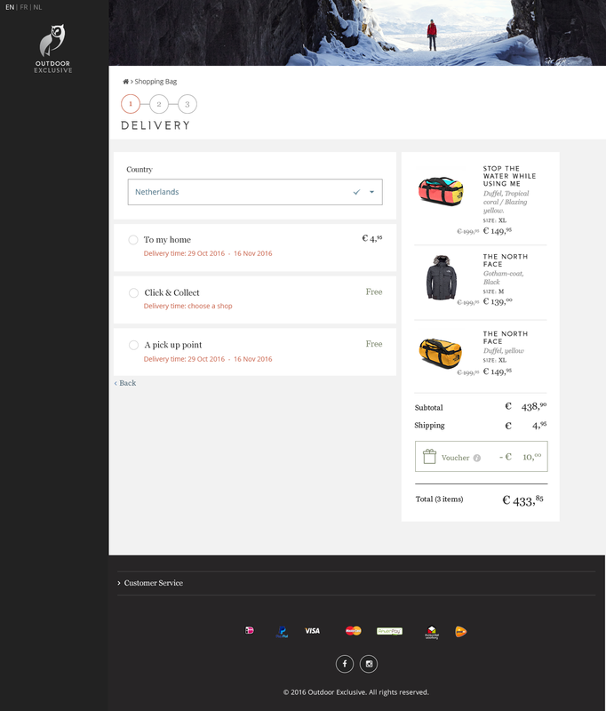
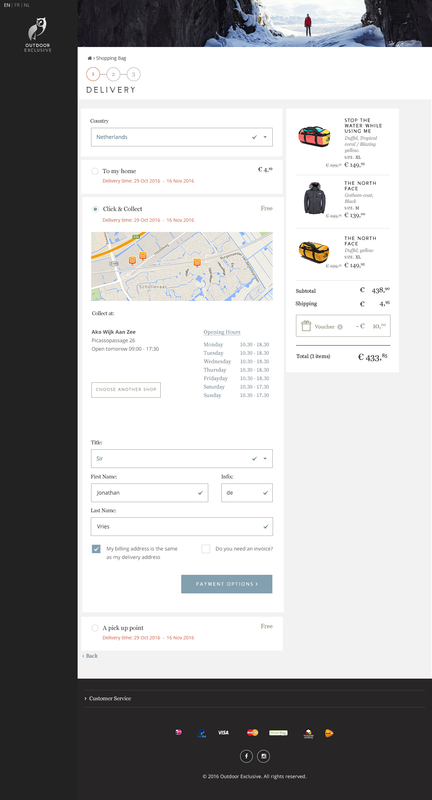
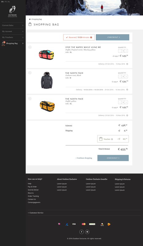
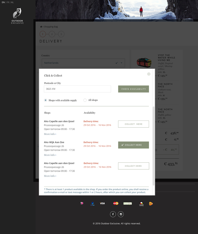
Visual design of the webshop (desktop)
|
Webshop Outdoor Clothing
|
|
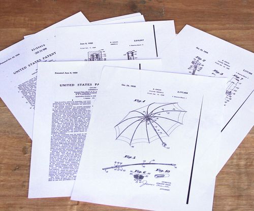
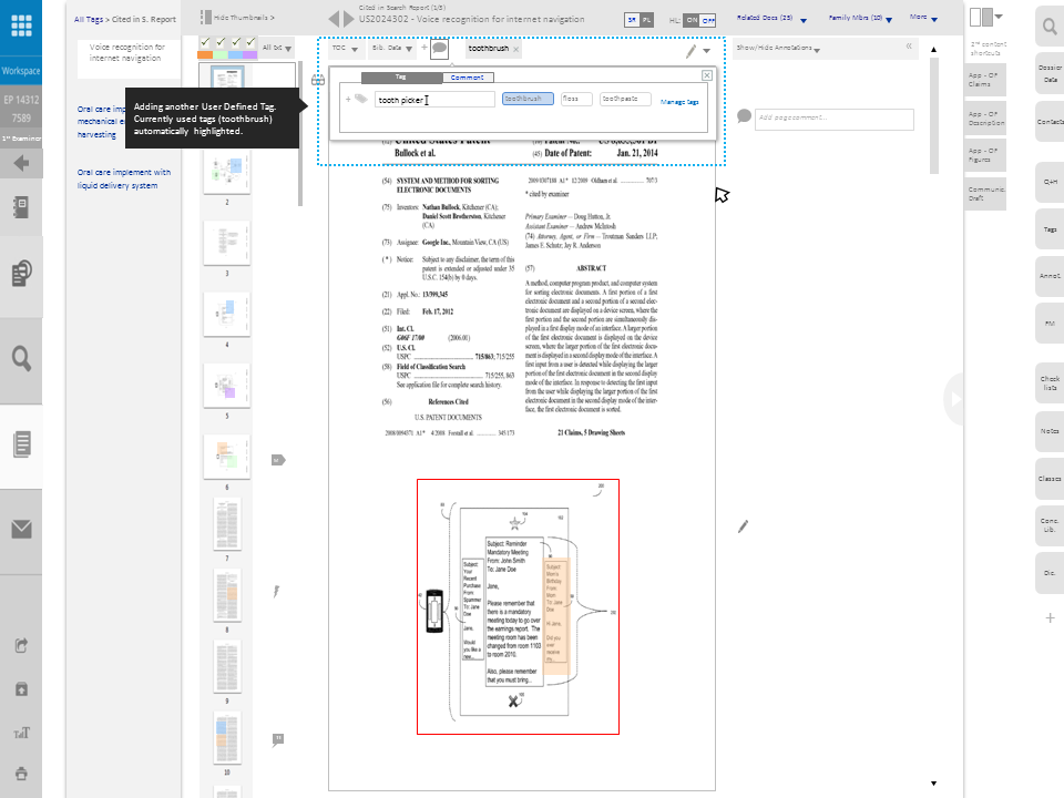
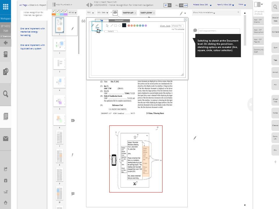
Paper patent files and the digital versions
|
Digital Patent Application
|

|
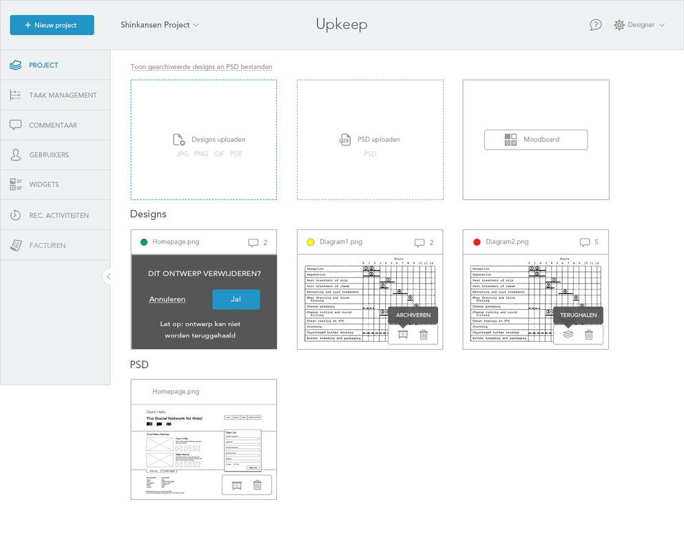
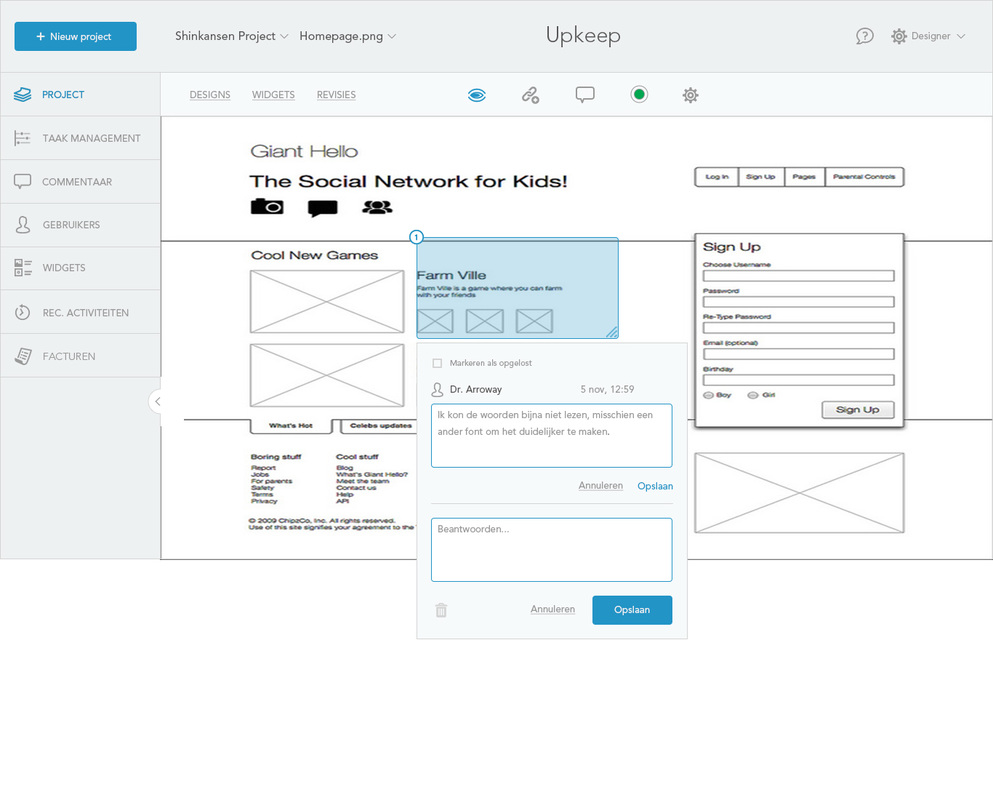
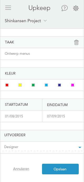
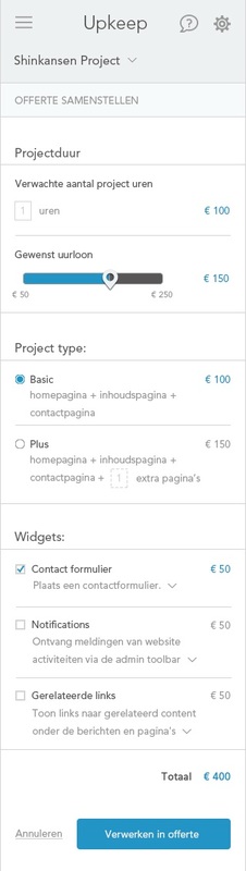
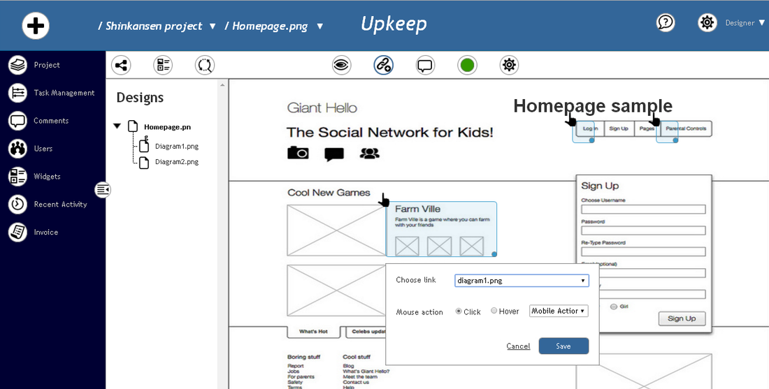
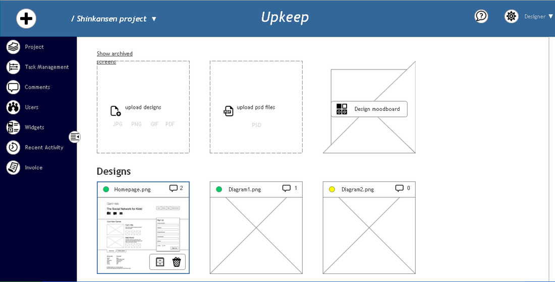
User interfaces of the prototyping tool (desktop and mobile)
|
Quick Prototyping Tool
|
|
Working environment in which the application is used (up) and user interfaces for the note application
|
Note App for Instructors
| |||||||||
|
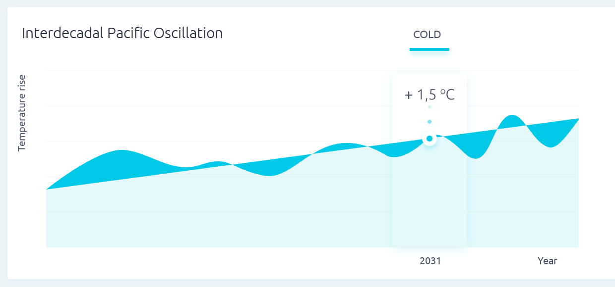
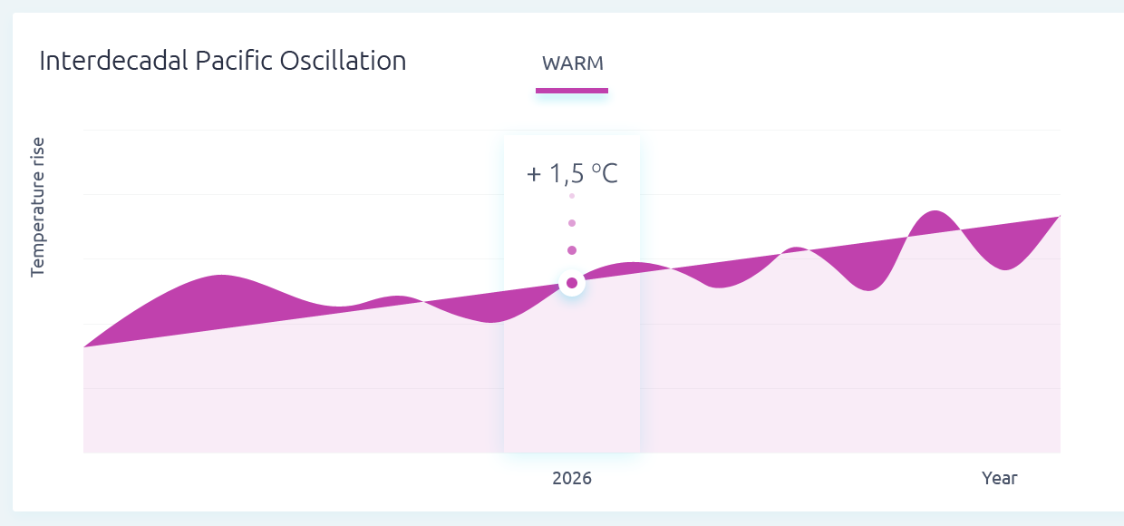
Infographics depicting the rise of global temperatures
|
Infographic science article
|
UX Research
|
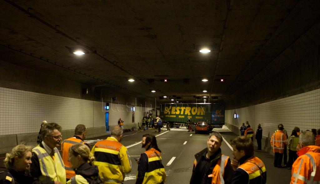
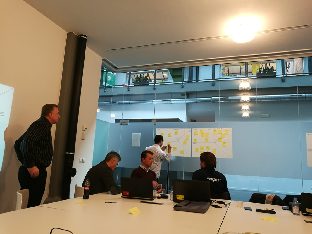
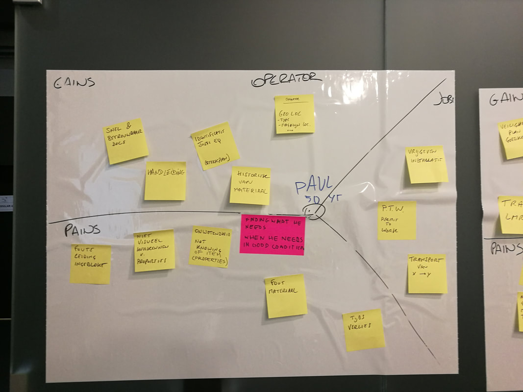
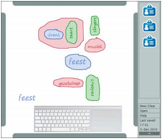
Workshop sessions with tool instructors: mapping of the working routines
|
Workshop with inspectors
| |||||
|
Examples of usability issues in the user interface
|
Usability Optimisation
| |||||
|
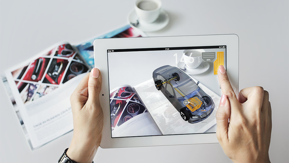
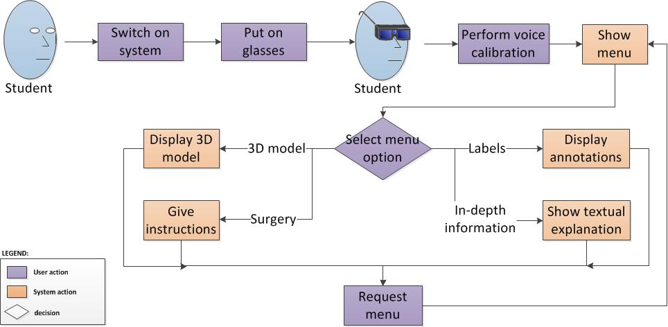
Examples of the use of Augmented Reality
|
Augmented Learning
| |||||||||

|
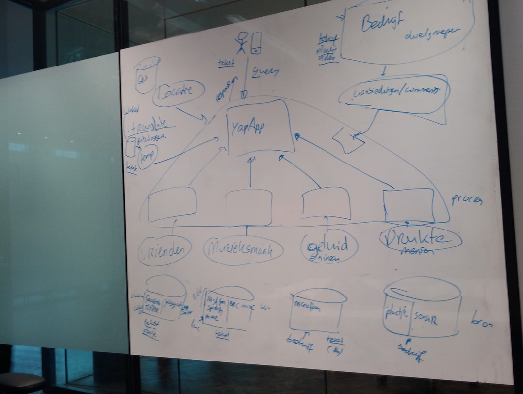
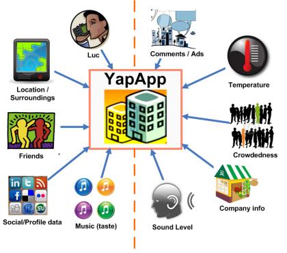
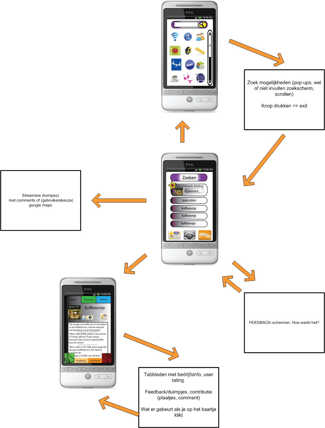
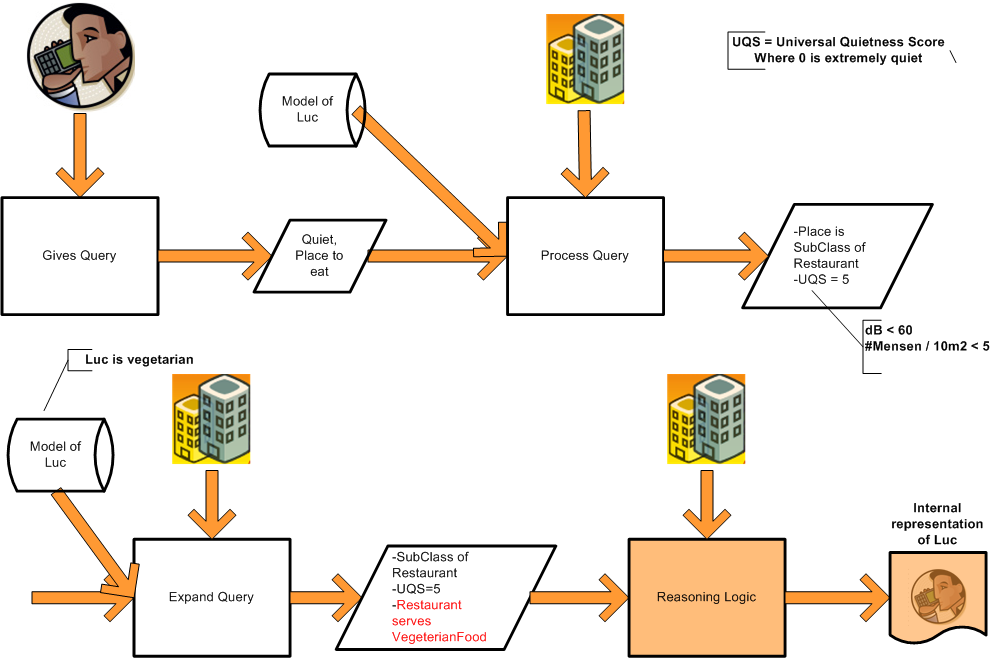
Data processes for the YapApp application
|
Intelligent Mobile App
| |||||
|
User interface mock-up of the interactive brainstorming table
|
Interactive Brainstorming
| |||||
|
User interface mock-up of the card game (mobile)
|
Educational Mobile App
| |||||
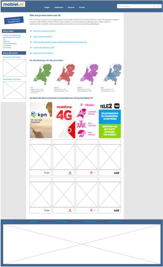
Re-design concept of the web page
|
Mobiel.nl Usability Research
| |||||
|
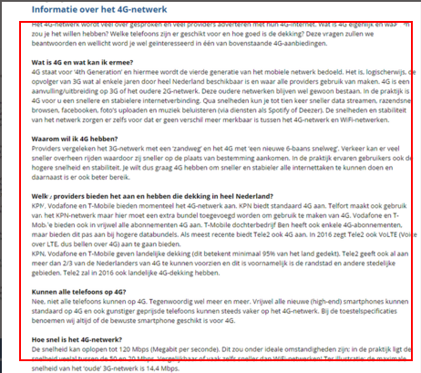
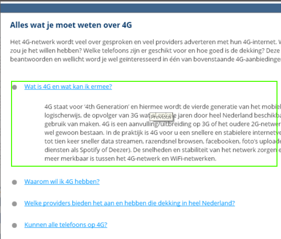
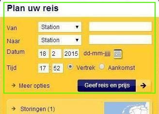
Example of an usability issue: too much ambiguity. Users can choose from 2 travel planners, but the purpose of each is not immediately clear (left). The improved travel planner combined both planners into 1 travel planner (right)
|
NS Usability Report
| |||||
|
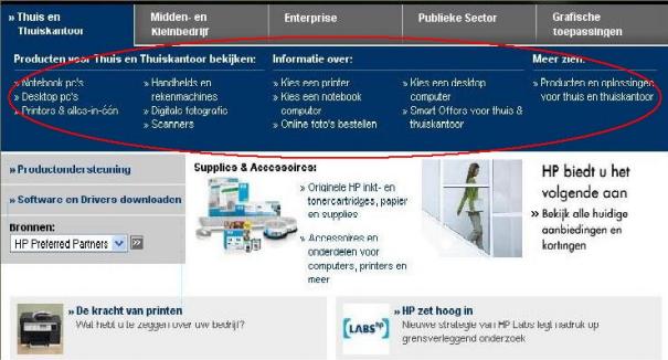
Examples of an usability issue: too much information. The test users had difficulty in navigating or finding the information that they were looking for.
|
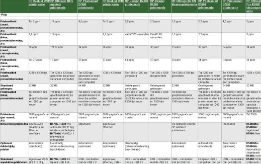
HP Usability Report
| |||||
|
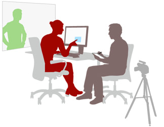
User testing scenario. A test user explains her actions, while the evaluator takes notes. The session is recorded so that the conversation and body language can be analyzed.
|
Online User Behaviour
| |||||
|
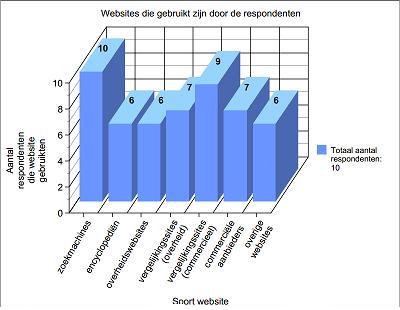
The stimuli that were presented to the participants
|
Memorising Visual Cues
| |||||
Contact information
|
|
